Client
Organized Chaos Pro
A brand for a professional organizing and estate-cleanout service — one that had to feel calm and trustworthy while owning the word “chaos” right in its name. Order and chaos, built into a single mark.
Organized Chaos Pro helps people reclaim their space — home reorganization, pre-sale and moving clean-outs, home staging, paperwork sorting, and estate and inheritance help. It's sensitive, physical work, often done at emotional moments.
The brand had to hold two ideas at once: the reassuring order a stressed client is hiring for, and a bit of warmth and humor that says the mess doesn't scare us. The tagline says it plainly — “We Sort The Stuff!”
The logo does exactly what the company does: rigid, all-caps “ORGANIZED” gets cut across by a loose red hand-script “Chaos” — order and chaos in one lockup — anchored by a steady gray bar and a quiet “PRO.” Structure and personality, holding hands.
A trustworthy blue does the reassuring; a hot red gives the script its spark; a neutral gray keeps things grounded. Set in a strong condensed sans with a hand-script accent.
A bold, single-color business card puts the mark front and center — the kind of card a client keeps stuck to the fridge until the job's done.
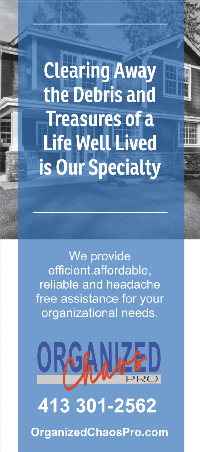
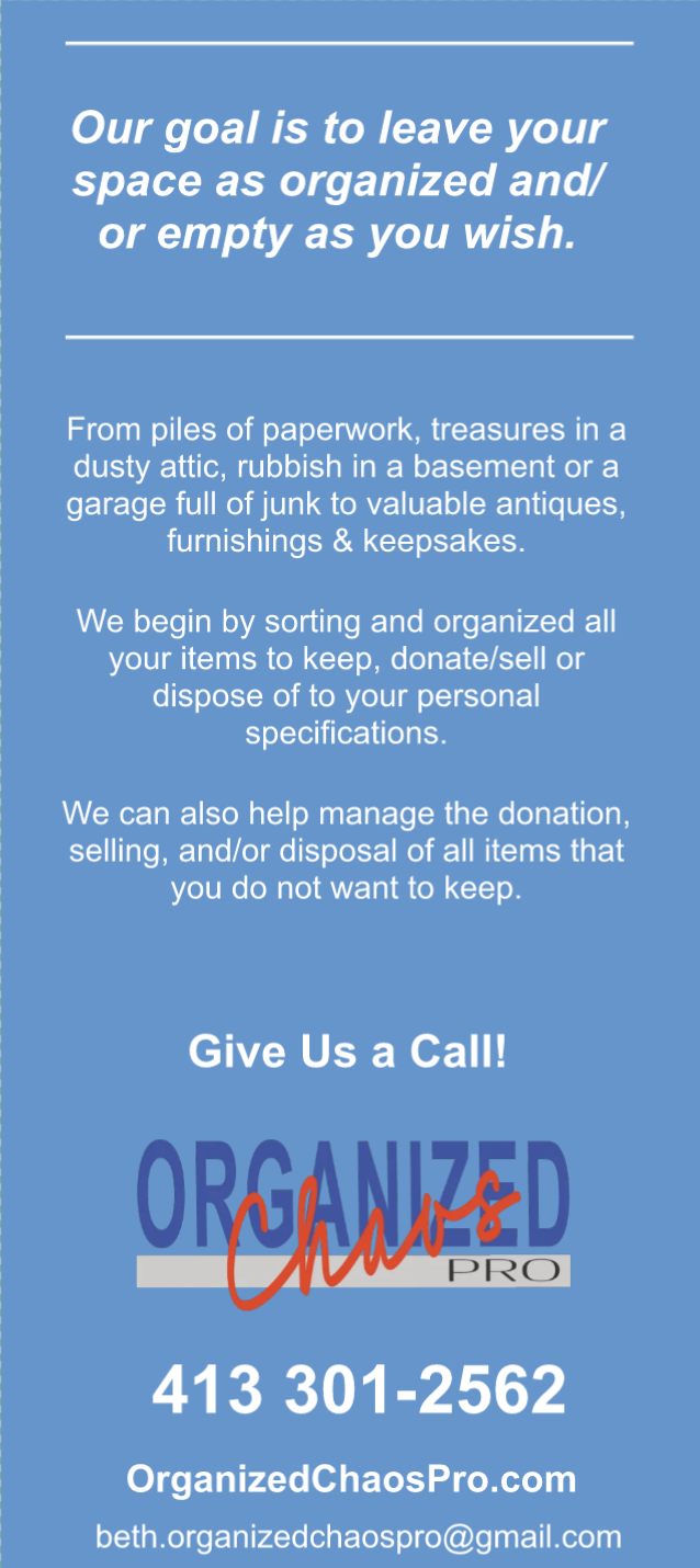
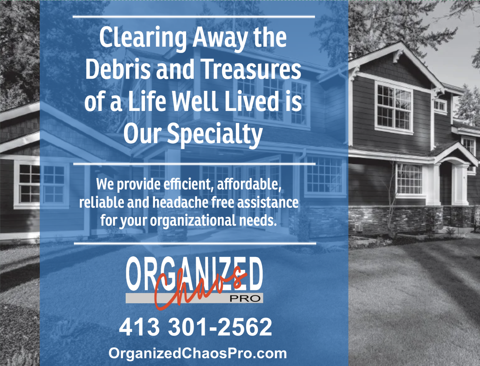
The rack card leads with a line written for the reality of estate work — “Clearing away the debris and treasures of a life well lived is our specialty.” The back lays out the goal and the process in plain, calming language, and a matching direct-mail postcard carries the same message to the mailbox.
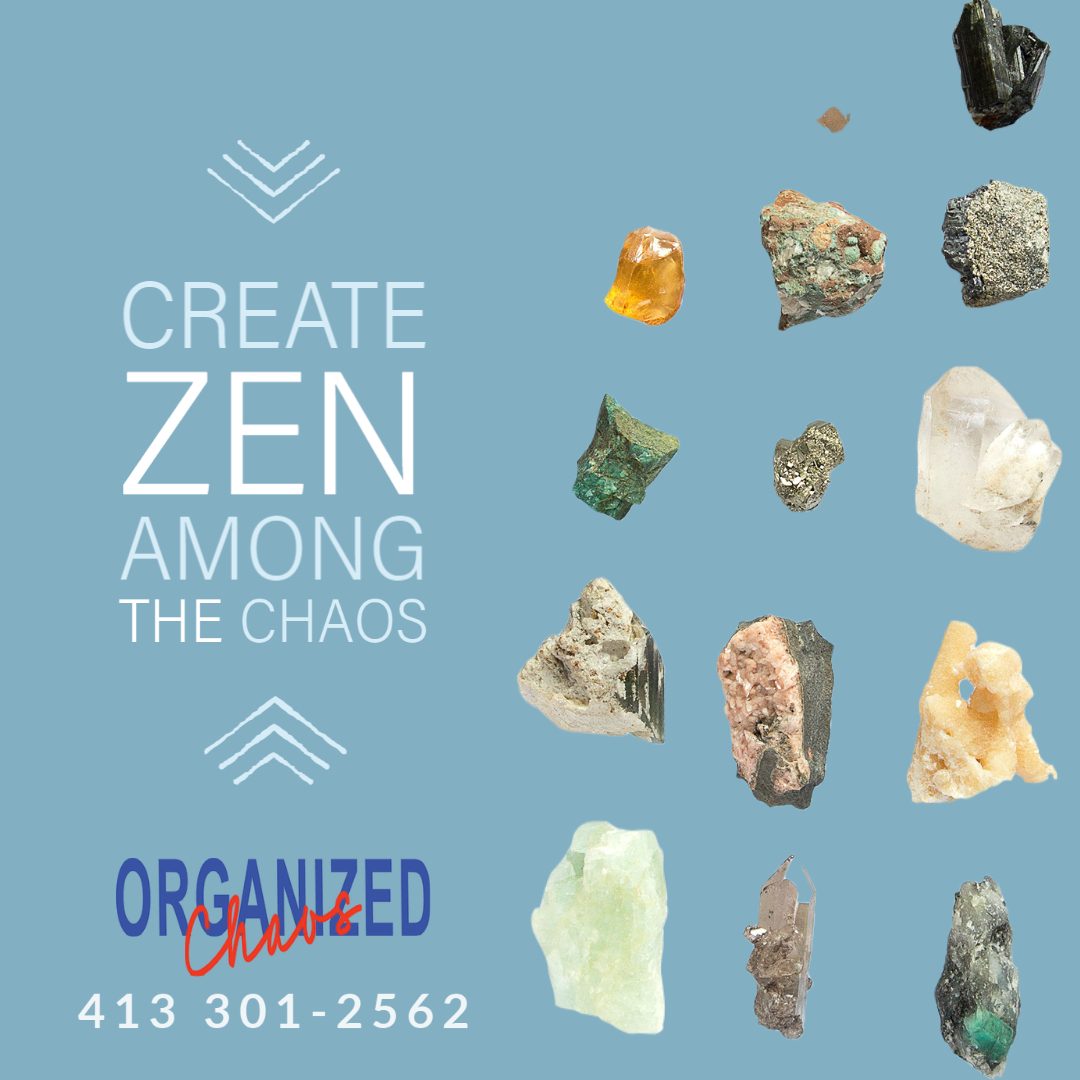
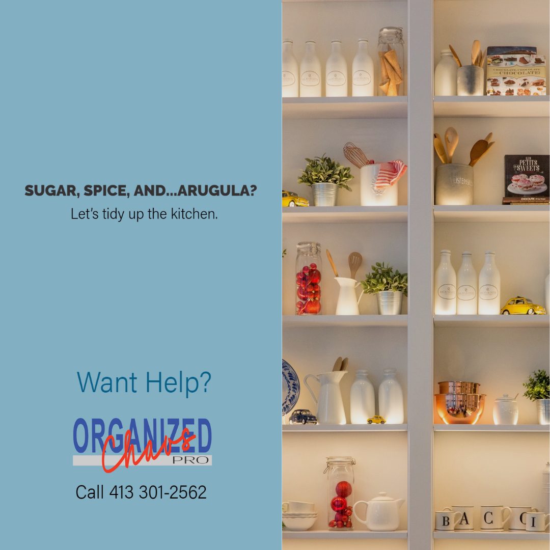
A social template turned everyday clutter into little moments of wit — from crystals to kitchen shelves — each one landing the same calm promise and call to action.
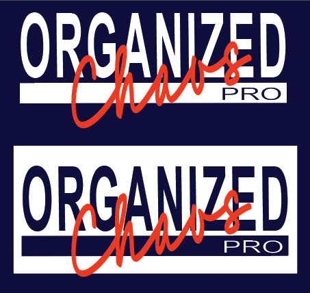
The mark was adapted for apparel in positive and reversed treatments, so the working crew reads as a team on any job site.
From one witty lockup, Organized Chaos Pro got a full kit — cards, rack cards, social, and apparel — that makes a one-owner operation feel established, and turns a stressful task into one clients feel good about handing over.