Client
Smokey Water Rib Co
Branding a lakeside barbecue joint from the ground up — a bold, no-nonsense wordmark, a hand-drawn pig mascot with real personality, and a full menu-board system that had to read across a busy dining room.
Smokey Water Rib Co is a lakeside barbecue spot serving ribs, smoked meats, and family-style platters. The brand needed two things at once: the weight and confidence of a serious smokehouse, and the warmth and humor that makes a place feel like somewhere you bring the whole family on a Sunday.
I built the identity around that tension — a heavy, blocky wordmark for the muscle, and a hand-illustrated pig mascot for the heart — then extended it into the menu boards, signage, and merch that make up the day-to-day experience.
Stacked, ultra-bold, and framed by rules — the logo reads like a stamp on a slab of ribs. It holds up huge on a storefront and shrinks cleanly to a shirt pocket or a sticker.

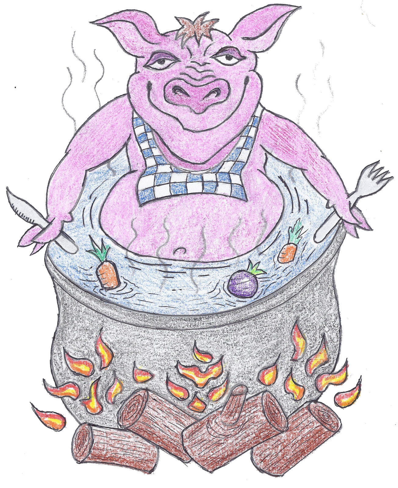
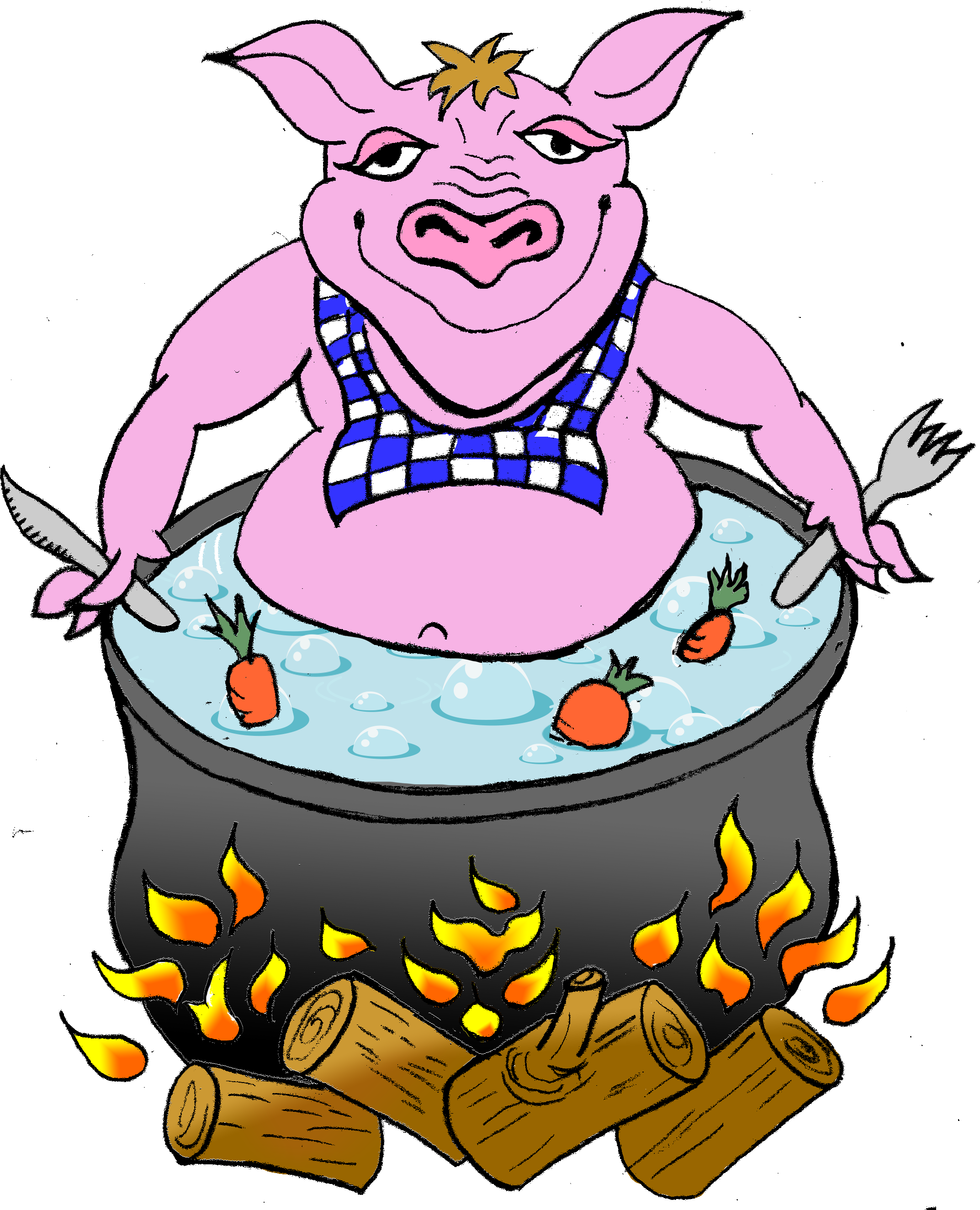
The star of the brand is a grinning pig relaxing in a simmering stockpot — equal parts mascot and inside joke. It started as a hand drawing, then I rebuilt it as a polished digital illustration so it could scale to signs, shirts, and stickers without losing its charm.
A simplified pig-head badge was drawn as a flexible icon — issued in a family of colorways so it could flex across apparel, signage, and social without ever looking off-brand.



Charcoal and cream do the serious lifting; a warm barbecue yellow brings the roadside-sign energy, and the mascot's pig-pink keeps things playful.
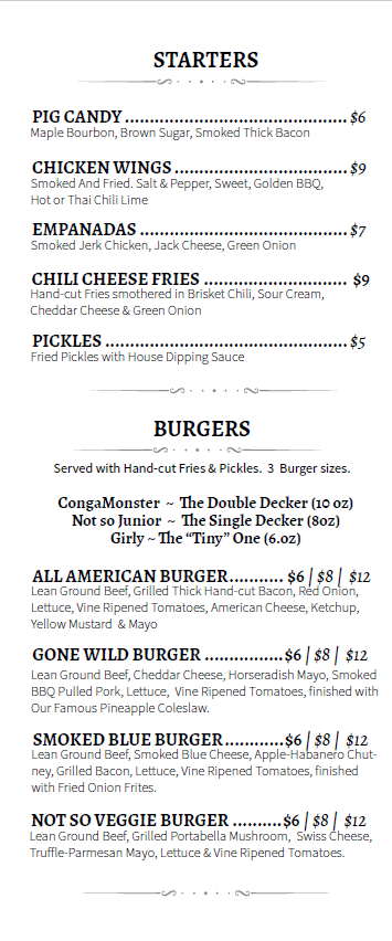
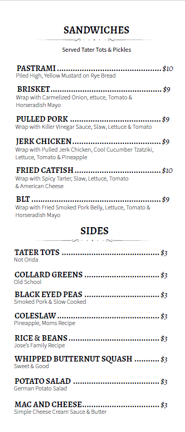
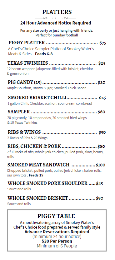
The food menu was designed as a modular set of boards — Starters, Sandwiches, Platters, Smoker, and Sweets — with a clear typographic hierarchy so a hungry line could scan prices and portions fast.
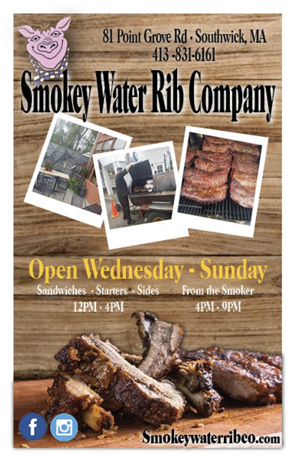
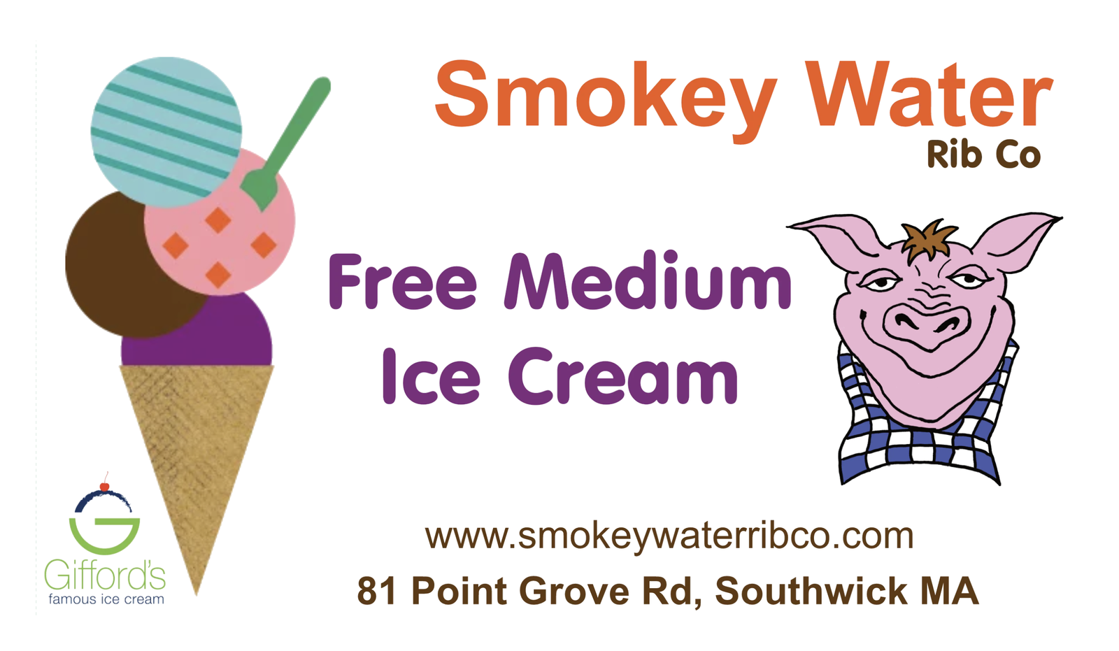
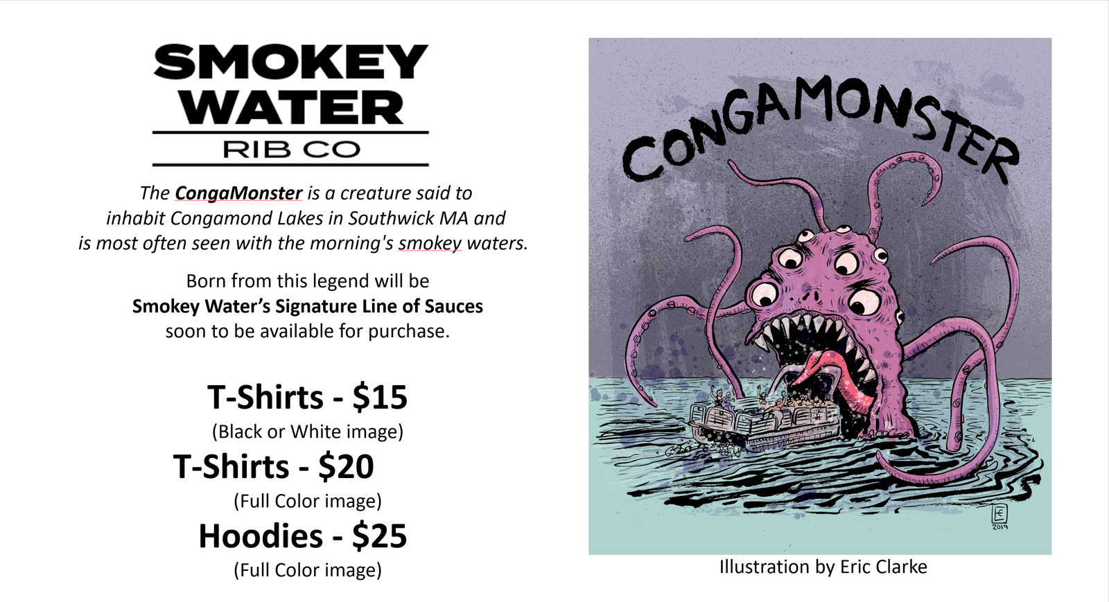
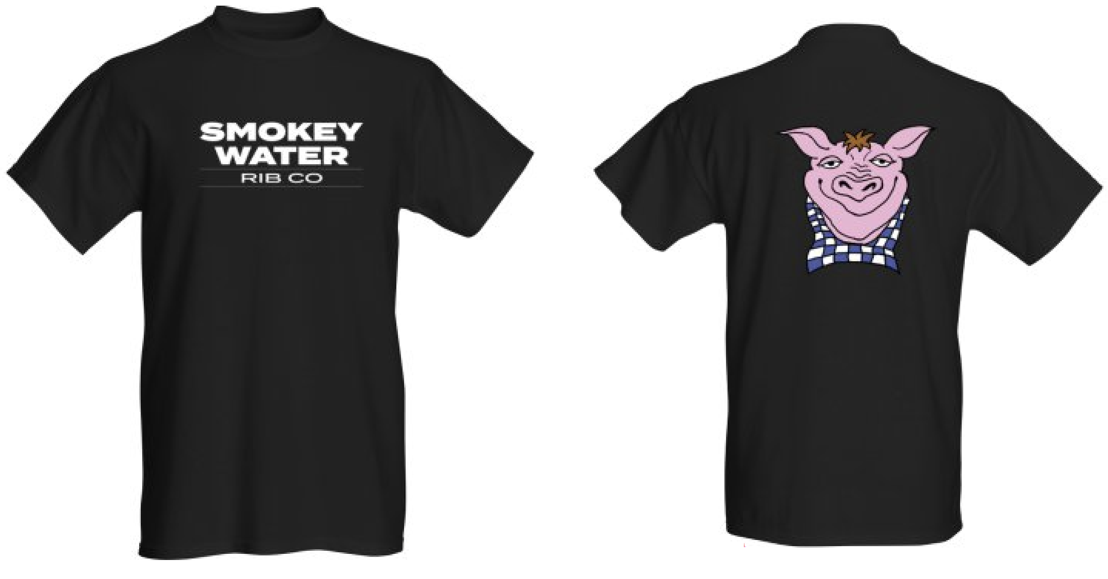
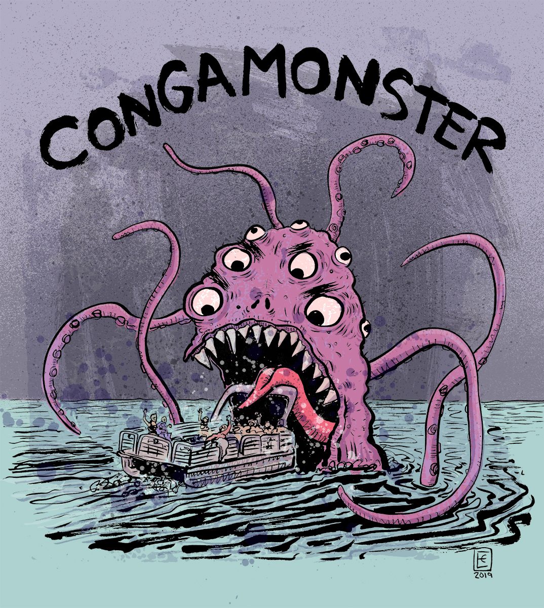
The identity stretched into seasonal promos and merch — a full-service poster, a free-ice-cream offer with Gifford's, staff and retail tees, and a playful “CongaMonster” line rooted in the local legend of nearby Congamond Lakes.
Southwick is a small, tight-knit town — word travels, and not much goes unnoticed. So the brand went to work long before the doors did. A steady drip of social posts through construction turned the build itself into a teaser campaign, each update stoking a little more anticipation.
It leaned on a piece of local lore: the CongaMonster, a many-tentacled creature said to haunt nearby Congamond Lake. Rendered by Southwick native illustrator Eric Clarke, the monster became an instant inside joke — the kind of wink locals recognize on sight — first in posts, then on merch.
By opening day the online buzz had outrun the official channels entirely: the first-day crowd caught town officials — who weren't watching the apps — completely off guard.
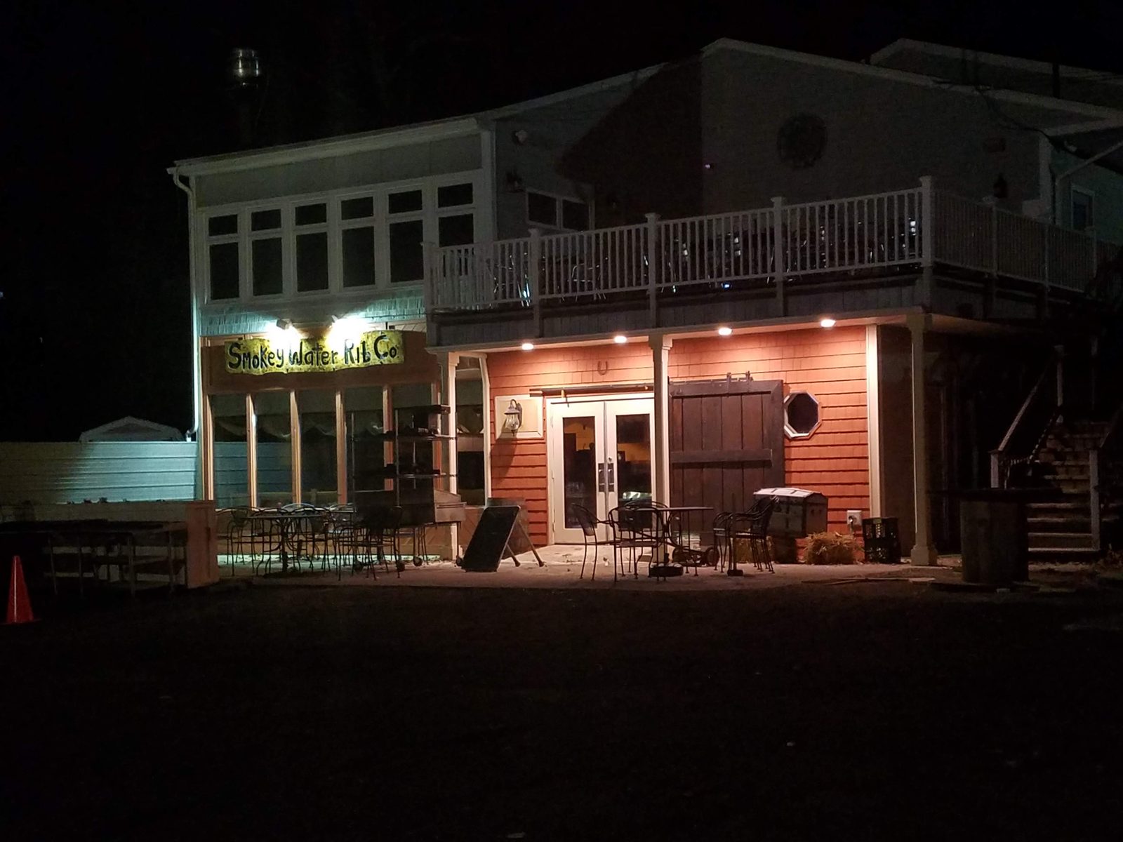
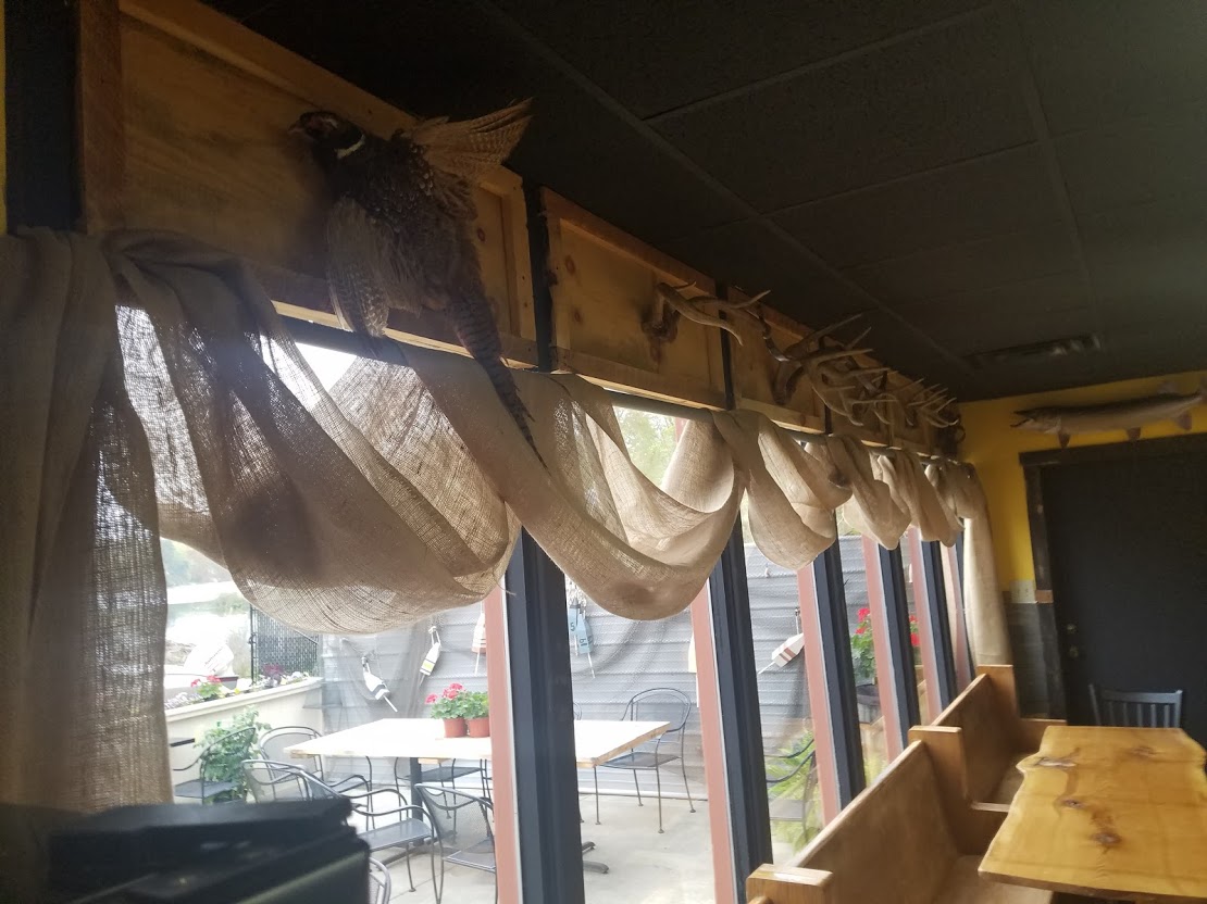
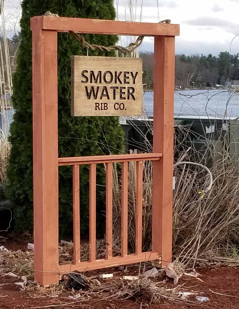
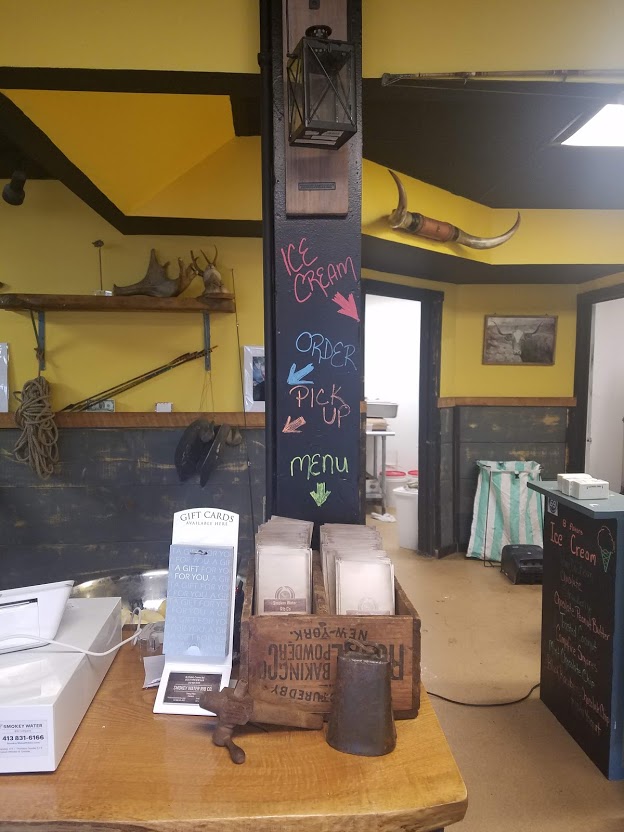
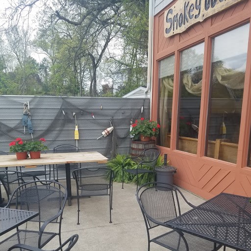
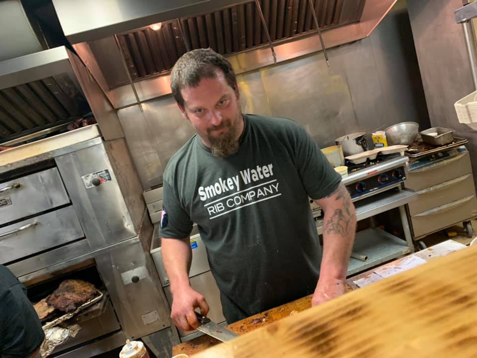
Once the doors opened, the identity settled into the room — a rustic, lakeside space where the brand's warmth matches the burlap, reclaimed wood, and water views.
From wordmark to mascot to menu boards, Smokey Water got a cohesive identity that works as hard as the smoker does — serious enough to trust with dinner, fun enough to put on a t-shirt.