Client
SurfaLux™ — glass coating technology
Taking a beautiful but structureless Figma comp file and turning it into a build file: a tokenized, accessible, responsive design system with 190 variables, 32 component sets, and 27 page frames across three breakpoints — with the developer handoff spec written as it went. Brand direction by the studio 9045andco.
SurfaLux makes a hydrophobic coating for architectural glass — the kind of product whose proof is in a photograph of water refusing to stick. 9045andco set the brand direction and initial comps ahead of final client content, deliberately, so the structure could be built while copy was still being written.
What arrived was six page frames of visual direction — and no reusable objects of any kind. Every page was absolutely-positioned rectangles and text. My scope ran from the visible craft — the icon set, image generation and editing, page layout and the carousels — down to everything underneath: the token architecture, the component library, the accessibility decisions, the responsive system, and the handoff document a developer could actually build from.
The brief asked for six things — header and footer, an accordion FAQ, a data-capture widget, button and type styles, content sections, and “an overarching design system, responsive and accessible from the outset.” None of them existed as objects when I started. All of them do now.
Before any of the system work, there was the work you can see. The comps carried brand direction, a few flattened reference icons and placeholder art — no icon library, and no photography that could survive being blown up to full-bleed width. The icon set and the imagery on this site were produced for this build, alongside the layout and the carousels.
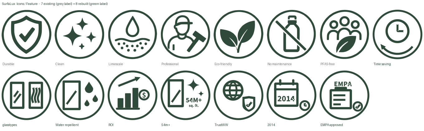
Icons are not placed loose on the page. They sit inside an Icon Callout component, and the component takes its colour from a collection that holds exactly one variable — ink — with four modes. Set the mode on a section and every icon inside it recolours at once. Nobody has to remember which green a callout is supposed to be on a dark band, because nobody is choosing it.

The brand photography was shot by 9045andco’s photographer — the hero, the comparison, the machine. What that shoot did not cover was the applications themselves: the five surfaces the coating actually sells into. The SurfaLux applications carousel is mine end to end — shower doors, windows, glass railings, solar panels and car windshields, every one of the five slides generated with AI, then graded and composed to sit beside the photography without announcing itself. So is the professional-application band further down the coating page. The SurfaLine machine pages are photographed throughout: that hardware is real, and it was shot.
Matching is the whole job. Same low-key lighting, same cool glass against warm interior, same depth of field, same restraint about how much beading is on the surface. The test was never whether a generated image looked impressive on its own — it was whether it looked like it came off the same shoot. An image that reads as a different library is worse than no image at all.
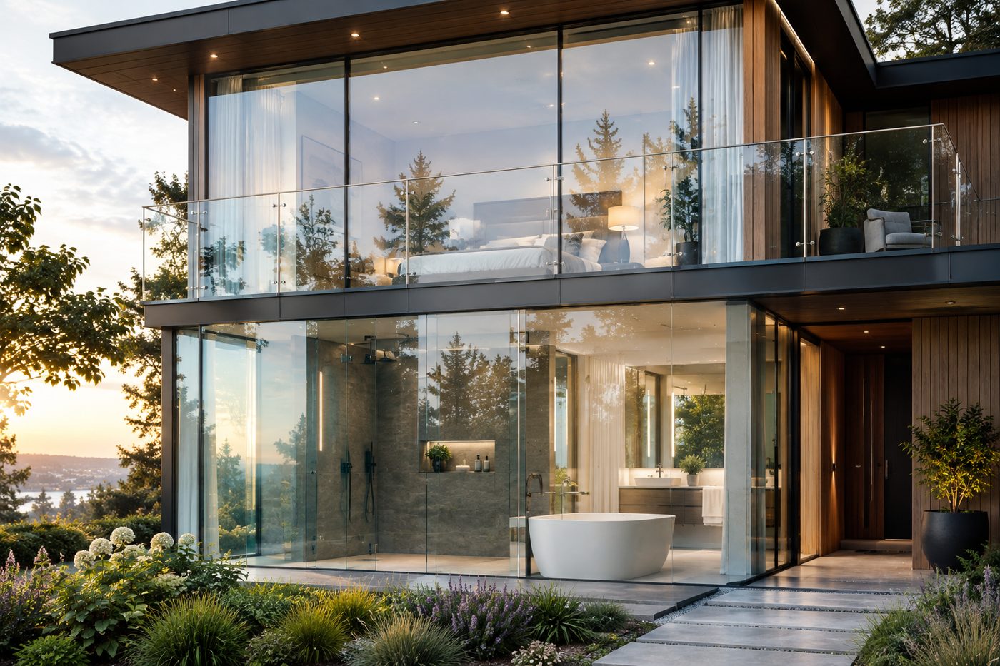
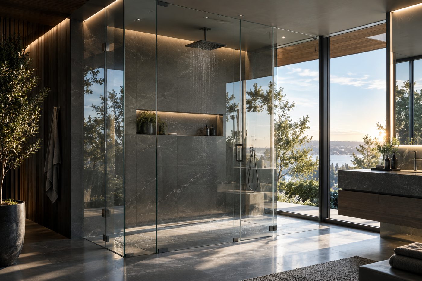
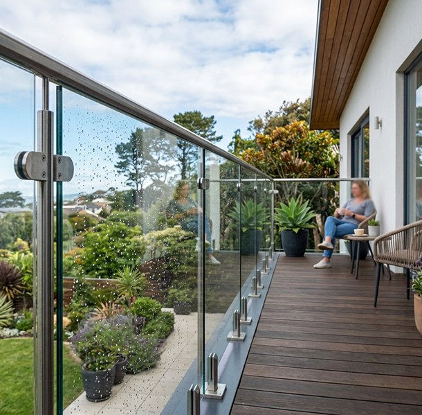
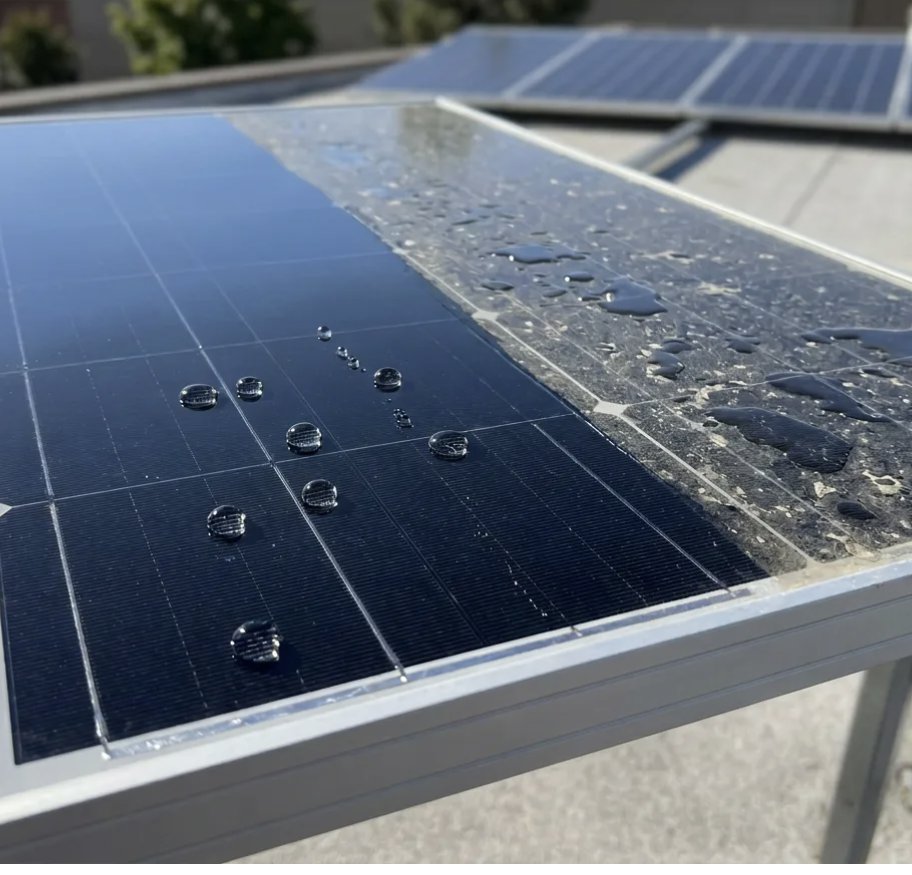
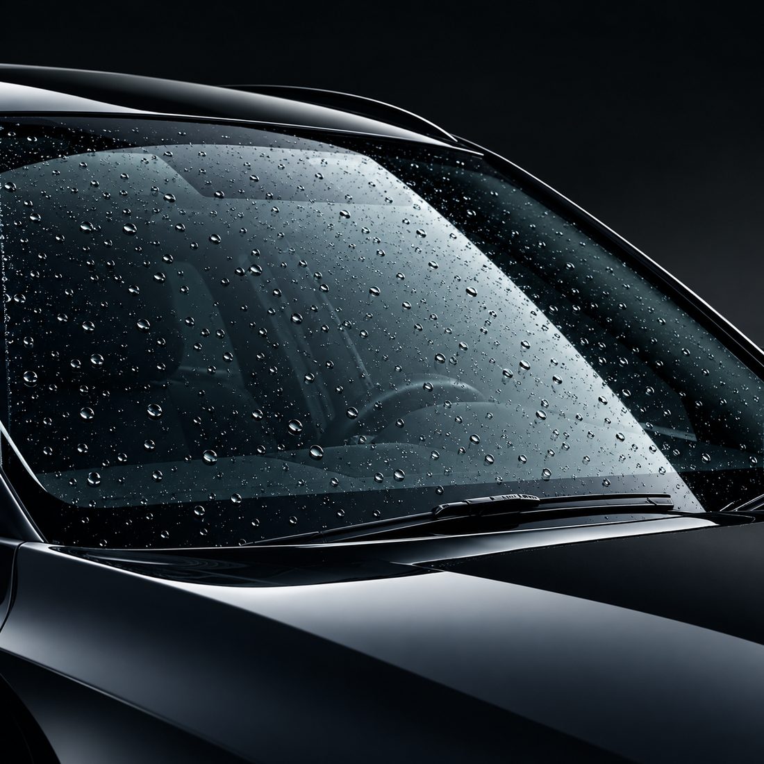

Every image ships at the size it is used at. The carousel card renders at 1232×599 on desktop and 688×578 stacked — separate files, not one photograph scaled by the browser. The alternative is a full-resolution render being downloaded to fill a card, on a site whose audience is often standing on a job site.
Before proposing anything I audited all six frames and every loose object on the canvas, and reported the measured state rather than an impression of it. These are counts read from the live file, not estimates:
The audit was written to be useful rather than damning. Designing ahead of content is a legitimate choice and the visual language was consistent enough to tokenize cleanly — three typefaces, five colors, a small set of genuinely repeating patterns. A small, well-behaved system, not a sprawl. But it also surfaced fifteen structural findings that would each get more expensive the longer they sat:
| Finding | What it actually was | Cost if left |
|---|---|---|
| Header duplicated 6× | Five loose text nodes, a logo and a pill rectangle on every page — never grouped, let alone componentized. One nav label change meant six edits. | High |
| Footer duplicated 6×, inconsistently | Grouped on five pages, entirely loose on the sixth. Same picture, two structures — a developer builds it twice. | High |
| The FAQ accordion wasn't one | A static picture of an accordion: all five questions in a single text node, spaced with blank lines. No item structure, no states, no question–answer pairing. | Rebuild |
| The data-capture widget didn't exist | Required by the brief. Not present in any state — and neither was the warranty form, despite a page named for it, nor a contact form. | Blocking |
| Six images in three slots | Duplicate image nodes stacked 1px apart. Whichever sits on top wins; someone exports the wrong one. | Medium |
| Eight different left edges | 83 · 88 · 92 · 104 · 123 · 139 · 140 · 141px, where there should be one container and one gutter. Three of them are indistinguishable drift. | Medium |
| A transparent accident | rgba(217,217,217,0) on every outline button — Figma's default gray dropped to 0% alpha. It renders correctly and means nothing. | Low |
The highest-risk item wasn't structural — it was legal. Two of the three typefaces are licensed for desktop use only. A desktop licence lets you design with a font; serving it on a public site ships the file to every visitor and needs a separate webfont licence. Neither blocks design. Both block launch — and finding it late would mean re-setting every heading and label in the system.
The original comps were duplicated into an archive page before anything was touched, so the studio always had the untouched version to compare against. Everything after that was additive.
Tokens only pay off if they're layered. Raw values live at the bottom and are hidden from every picker in the file, so a designer physically cannot reach for a hex — they have to reach for a meaning. If the meaning is missing, the answer is to add the token, not to work around it.
Green ramp anchored on two real brand values. Neutrals, feedback ramps, spacing, radius.
surface · text · border · action · feedback · overlay. Every pairing contrast-checked before it was created.
3 families, 4 styles, an 11-step size scale, 9 line-heights, 3 tracking steps.
6 widths, container max, four gutters, column counts, max measure.
One variable, ink, carrying the four approved icon colours. Set the mode on a section and every icon inside it follows.
Two findings the ramp produced. The green ramp was built mathematically around Alpine Green as step 700. When the studio later added a second brand green independently, the derived 400 step landed within one value in two channels of it — a useful signal that the ramp's maths matched the brand's intent. It was snapped to the exact brand value.
The second was less flattering and more useful: the documented type ramp specified a display weight the site does not use. A scan of the live pages found 18 of 19 licensed-font headings set in 45 Light and exactly one in the documented 35 Thin — and no token existed for the weight actually in use, so nothing could have been bound to it. The specimen and the pages now agree. They didn't before, and nobody had checked.
The brand palette is small and strong. The work was giving each value a defined role — a colour doing three unrelated jobs isn't a token yet, it's a coincidence.
Primary CTA fill and section surface. White on it measures 9.7:1 — AAA.
Secondary CTA fill. Black label required — see the contrast table below.
Light surface. Anchors the neutral ramp and drives the Light mode.
A metallic spot ink screens can't reproduce. Flagged, unbound, awaiting a decision.
The brief asked for accessible from the outset, so every semantic pairing was measured before it became a token rather than audited afterwards. The core palette turned out to be genuinely strong — three of the four primary pairings clear AAA.
One pairing did not, and it mattered: the new CTA green. White on it is 3.05:1 and fails AA at the 14px button label size. Black on the same fill is 6.89:1 and passes at any size. So black labels are required — not preferred. The hover and active states also step lighter rather than darker, because the next step down fails against a black label. That's the kind of rule that gets quietly "fixed" by someone darkening a hover six months later, so it's written down in the file, not just in my head.
| Pairing | Ratio | Result |
|---|---|---|
| White on Black | 21:1 | AAA |
| White on Alpine Green | 9.7:1 | AAA |
| Black on Gray | 18.1:1 | AAA |
| Black on Light Green | 6.89:1 | AA — any size |
| White on Light Green | 3.05:1 | Fails AA at 14px |
| Control border on raised surface | 3.89:1 dark / 4.30:1 light | Clears 1.4.11 |
| Metallic Silver as body text on white | 3.34:1 | Fails AA |
Nothing in the comps showed keyboard focus. Every interactive component now carries the same 2px focus ring — button, all three input types, checkbox — so focus is one visual language, not five. 2.4.7
Accordion toggles were 15×15px. Carousel dots were bare 16px circles. Both now sit inside hit frames that clear the minimum, and checkbox targets are the full 44px row rather than the box. 2.5.8
The comps had no error, success, focus or disabled colour at all — on a site with two forms. A full feedback token set now drives an error summary banner plus per-field messages, each prefixed with a glyph so colour isn't the only signal. 1.4.1 · 3.3.1 · 3.3.3
When a multi-column section stops fitting it stacks rather than squeezing — the threshold is any column falling below 320px. Written into the handoff so it isn't re-litigated per page. 1.4.10
Field labels are persistent elements, never a placeholder standing in for one. Input values are set at 16px because iOS zooms the page on focus for anything smaller. 3.3.2
Six full-bleed heroes put white text over photography with a 60%-opacity raster PNG as the only scrim — including one with bright snow directly behind the headline. Contrast there isn't measurable. Scrim tokens are built and ready; the treatment is the studio's call. 1.4.3
Button is the component every system gets wrong in the same way — by encoding content as variants and exploding the count into the thousands. Here the style, size and state axes are variants; label text, icon presence and icon choice are properties. Six styles × three sizes × five states is 90 variants, which is a perfectly reasonable number. Encoding the label as a variant would have made it unbounded.
| Default | Hover | Focus | Disabled | |
|---|---|---|---|---|
| Primary | Call to action | Call to action | Call to action | Call to action |
| Secondary | Call to action | Call to action | Call to action | Call to action |
| Tertiary | Call to action | Call to action | Call to action | Call to action |
| Quaternary | Call to action | Call to action | Call to action | Call to action |
| Outlined | Call to action | Call to action | Call to action | Call to action |
| Text | Call to action | Call to action | Call to action | Call to action |
The CTA tokens are deliberately mode-independent — the same green on any surface. The previous arrangement flipped white and black by mode, which is exactly why a white button and a black button couldn't be chosen independently. Splitting them was a two-token change that removed a whole class of override.
Everything the brief asked for, plus everything the comps repeated — thirty-two component sets and five standalone components, 323 variants between them. Each one auto-layout, semantically bound, with its states designed up front rather than invented later:
Replaced six hand-drawn copies with instances. The mobile pattern is a full-screen overlay rather than a slide-in drawer — there are only five destinations, and an overlay costs nothing to build and nothing to explain.
Slot-based link columns, so the count can change without redrawing. Reworked mid-build: social squares out, the company column retired into a horizontal legal bar beside the copyright line.
Rebuilt from nothing — the original was five questions in one text node. Real item structure, collapsed and expanded states, and a slot for the answer so it accepts any content.
Text, Textarea, Select and Checkbox — none of which existed. Seven states each on one axis, including a character counter that turns error-coloured over the limit and says how many characters to remove.
The data-capture deliverable. Five fields, three states, and the success swap wired inside the component set — see below for why that distinction mattered.
Five slides, auto-advancing on a loop with smart-animate. It replaced a hand-built card row that had been sitting orphaned off-canvas — a real reusable pattern that never got placed into a page.
The brief called for a data-capture modal or widget. I argued for an on-page section instead, for two reasons: five fields fight a modal, and a modal can't be linked to from an email — which matters if the client wants to drive traffic straight to warranty registration.
The more instructive detail is where the interaction lives. Figma only lets a prototype navigate action target a frame on the same page, so the header's page-to-page links had to be wired as instance overrides — thirty of them, by hand, with every new page needing its own. The form's submit avoids that trap entirely: it's a state change inside the component set, so it works in every instance, on every page, at every breakpoint, wired exactly once.
Both states are pinned to identical dimensions, so the swap doesn't shift anything below it on the page. And the error state is built but deliberately unwired — documented rather than prototyped, so the treatment is unambiguous for the developer and nobody has to invent it later.
We have sent a confirmation to the email address you provided. Keep it for your records — you will need it if you ever make a claim.
Responsive was built during the system, not retrofitted onto it — retrofitting is the single most expensive mistake available on a project like this. Every page exists at 1440, 768 and 375, with navigation wired at all three widths.
Type steps down through modes on the typography collection, which carry sizes only. Families, styles, line-heights and tracking are identical in all three, deliberately: the moment a family varies by mode, any context that can't load that font can no longer bind or edit the text.
| Token | Desktop | Tablet | Mobile |
|---|---|---|---|
| font/size/4xl — hero headline | 85px | 48px | 34px |
| font/size/3xl — section heading | 55px | 38px | 28px |
| font/size/md — body | 20px | 20px | 20px |
| Container gutter | 104px | 40px | 24px |
Named honestly: the tablet and mobile heading sizes are proportional estimates, derived from the content-width ratio and rounded — not measured. The licensed display face can't be loaded in the environment the build ran in, so line breaks at 768 and 375 have never been seen. Correcting one is a single value edit that every page inherits, so the fix is cheap. The risk is that nobody looks — which is why it's item four on the open list rather than a footnote.
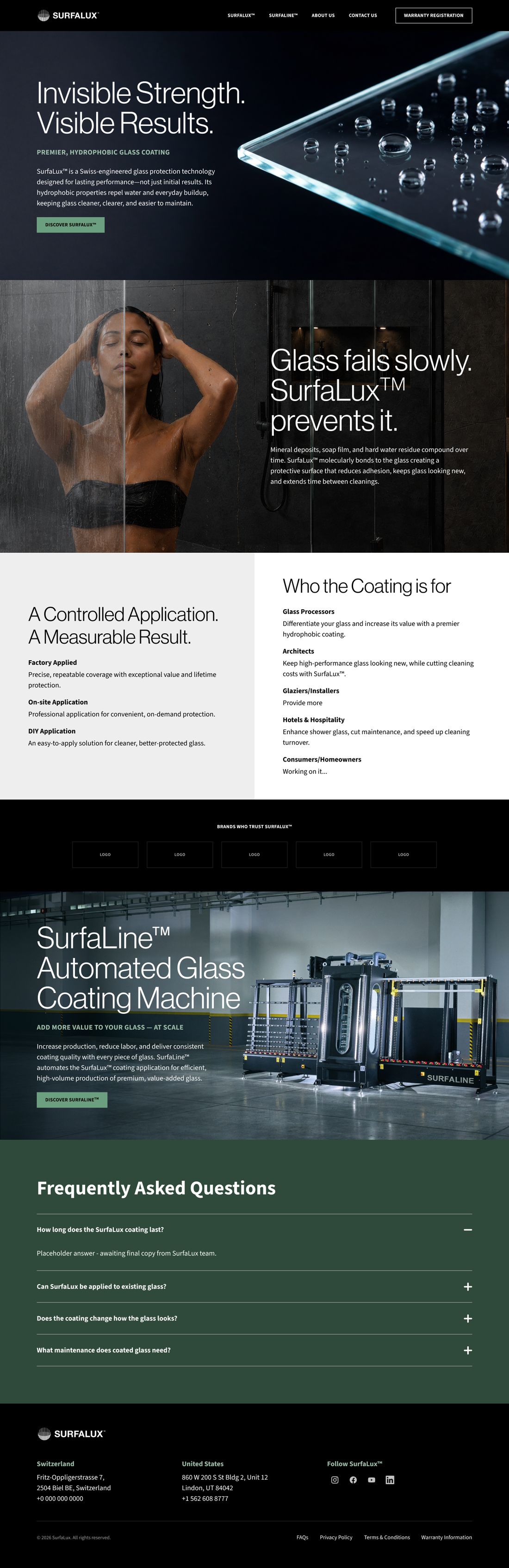
Every page was reassembled from components: each section auto-layout, every colour and gutter variable-bound, header, footer, button, accordion and carousel as instances. Zero overflow verified on all twenty-seven frames.
Pages whose copy is still unresolved open with an amber placeholder notice, and their layers are named — DUPLICATE, — PLACEHOLDER or — SLOT. That's a small discipline that does real work: it means nobody — client, studio or developer — mistakes a functional stand-in for an approved decision.
Handoff is the terminus of this project, and the build ran off it. But the first spec sheet was written the day the registration form was built, because the form's validation rules needed a written home immediately, not eventually.
That document sets the template for the rest: the error state as a visual reference, then five numbered blocks — fields and message copy, validation behaviour, submit behaviour, accessibility with the specific WCAG criteria cited, and the open questions the form still depends on. Naming what's unresolved is part of the spec, not an admission against it.
The handoff also ships a code-consumable token file alongside the Figma system — W3C format JSON plus generated CSS custom properties. It costs very little and removes the largest single source of handoff drift: a developer reading a hex off the inspect panel and typing one digit wrong.
label, variant, size, disabled — not "Text 1" or "Style A". Free alignment between the file and the code that consumes it.
Focus order, form validation rules, what happens on submit — recorded in Dev Mode, where the developer will actually look for them.
If the panel shows a raw hex, a binding is missing. That's the check, and it runs before handoff rather than after.
Eleven items, each with a named owner and whether it blocks. Font licences and the hero scrim decision sit at the top — both are design decisions with long tails.
Three things behaved differently from how the build plan assumed, and each one is now a permanent property of the file rather than an outstanding task. Recording them is the difference between a system the next person can trust and one they quietly work around.
| The plan | What actually happened | The standing consequence |
|---|---|---|
| Wire navigation once, on the Header component | Figma only permits a navigate action to target a frame on the same page. The component lives on one page, the site lives on three others. | All navigation is instance-level. Every new page needs its header wired by hand. Permanent, not a workaround to revisit. |
| Bind every text node to typography variables, so a font swap is one edit | The licensed faces can't be loaded in the build environment, and Figma refuses to bind or re-wrap text in a font it can't load. A binding sweep also wrote units that resolved wrong, damaging spacing system-wide. | Reverted, with a snapshot taken first. Font families are not variable-bound. A font swap stays a manual pass — precisely the cost the plan existed to remove. |
| Build each breakpoint | Cloning was the only method that carried the licensed display face through; retyping a heading silently substitutes it, and the substitution isn't obvious on screen. | The three breakpoints are independent copies, not linked views. Nothing propagates — which is exactly why the content-entry method had to be decided before copy started landing. |
The pattern worth naming: a fixed-height wrapper around a component instance hides breakage until the component changes size — which is precisely when you least want a silent failure. It cost 580px of dead space under one footer and 2,042px across a set of cloned pages before it was caught. Every wrapper added since hugs its content unless there's a stated reason not to.
Every one of those started at zero. The site is live at surfalux.com, built from them — and nothing left on the open list is blocked by a missing token or a missing component.
What the client gets out of it: copy arriving in pieces no longer costs a redraw, because auto-layout absorbs it. A changed decision — the green, the display face, the button treatment — propagates instead of being reapplied by hand across twenty-seven frames. And the next page starts at eighty percent rather than from a blank artboard.
Credits: Brand direction, initial comps and brand photography by 9045andco. Icons, image generation and editing, page layout, carousels, audit, token architecture, component library, accessibility specification, responsive build and developer handoff by Anita Larkin.