Client
Tomahawk Restoration Services
A complete identity for a Western Massachusetts home-restoration company — one mark carried across signage, print, documents, and a full website, so a small business could show up like an established one.
A restoration company does everything from power washing to carpentry — so the brand had to feel sturdy, trustworthy, and instantly recognizable on a truck, a lawn, or a phone screen.
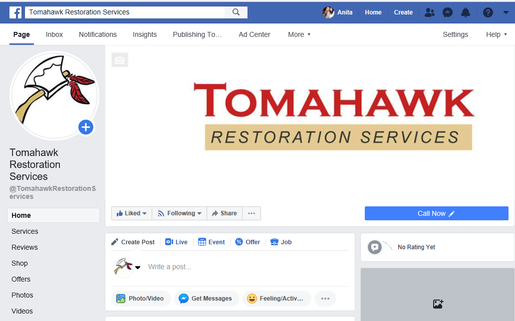
The name is a wink at the owner: Tom — “Tomahawk.” So the logo makes the pun literal, and doubles as a symbol of the trade: a hand-drawn tomahawk with red feathers, paired with a bold slab wordmark. The axe reads at a glance from a passing car; the wordmark holds up small on a business card.
The mark was built to survive real-world use — one color on a yard sign, full color on the web, reversed on dark backgrounds — without losing its character.
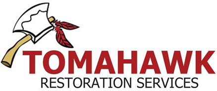
Four colors do all the work: a confident brick red for impact, a warm tan that nods to woodwork and craft, near-black for legibility, and clean white for breathing room.
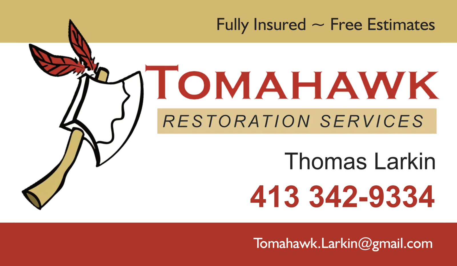
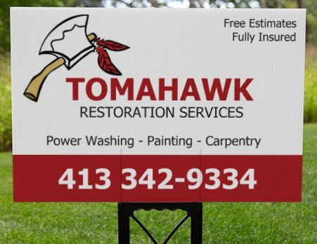
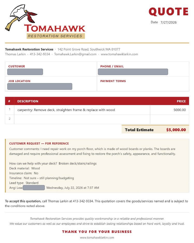
The identity was rolled out across the pieces a service business actually hands over: cards that get left behind, signs that stake a claim on a lawn, and documents that make a one-person operation feel buttoned-up.
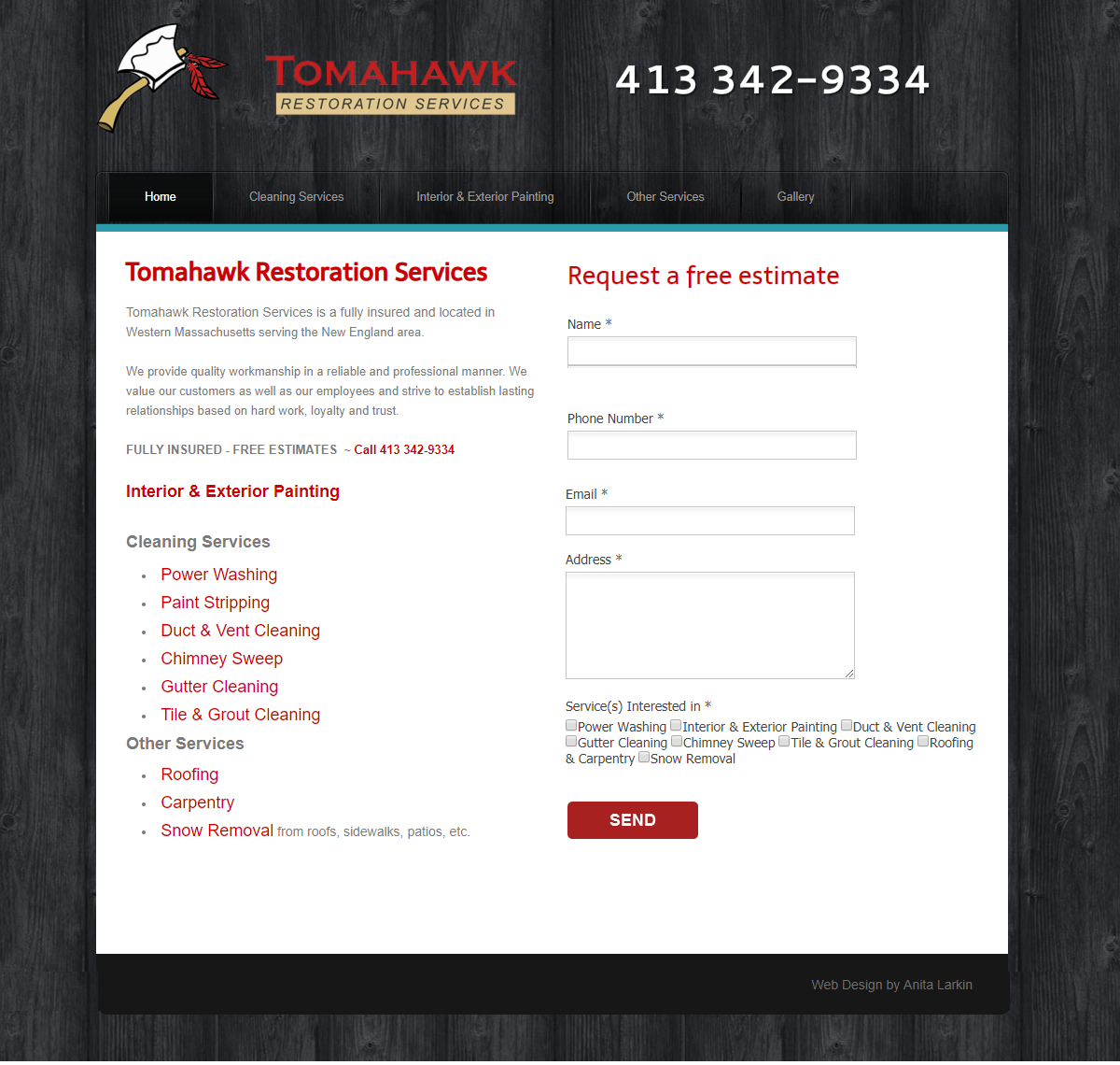
The homepage puts the phone number and a “Request a free estimate” form front and center, with services laid out in plain language. A dark, wood-textured frame carries the restoration feel while keeping the content area bright and easy to scan.
From a single mark, Tomahawk got a consistent identity that scales from a lawn sign to a letterhead to a live website — the kind of coherence that makes a new company feel like one you can trust with your home.